The colors you choose for your wedding room don’t just set the mood; they tell the story of your love in colors that last a lifetime.
Couples often feel stressed out when they have to choose the right colors for their wedding decor. There are so many colors, combinations, and trends that it might be hard to know what to do. If you pick the wrong design, your venue could appear flat or impersonal, which is not what visitors anticipate from such a special event. They want it to be warm and inviting, with a lot of visual harmony. Colors aren’t simply for decoration; they shape memories, change how you feel, and set the mood.
That’s why we’ve put up a selection of Wedding Room Color Ideas that mix classic style with modern style. Each color scheme has been carefully chosen to spark couples’ imagination and help them see how the appropriate colors can make a room feel like a reflection of their unique love story. We’ll show you how to make your wedding space seem personal, welcoming, and distinctive, from delicate, romantic pastels to strong, dramatic contrasts.
Blush & Buff Harmony – Romantic Neutrals with a Rustic Edge
Soft romanticism meets realness. The room has soft blush colors, sandy buff neutrals, and earthy terracotta, which make it feel both relaxing and very tactile. This color scheme for wedding interiors suggests closeness—warmth without being too much and elegance without being too sterile.
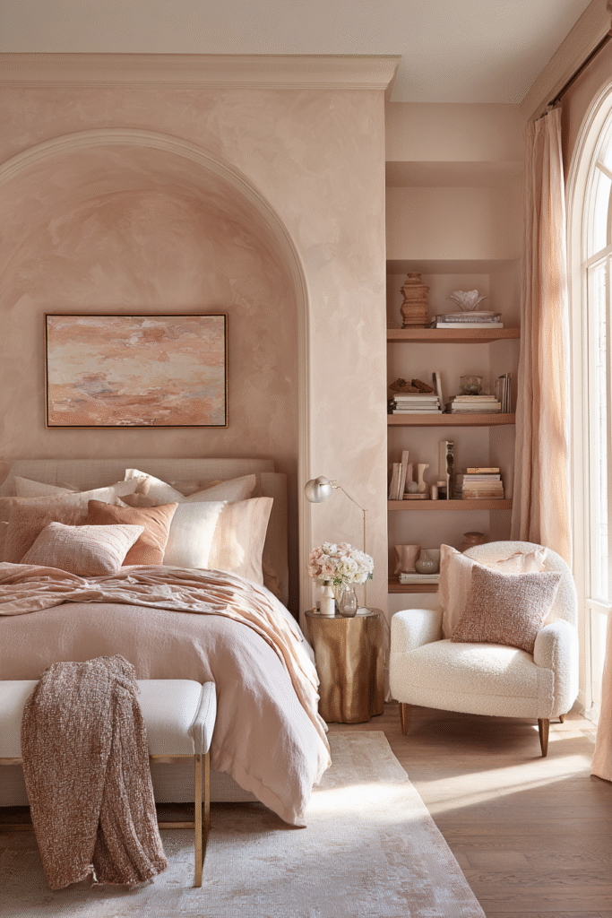
See how the linens are layered? The bedding is made of linen with a crumpled texture, the throws are made of cotton, and the pillows are in different colors. They make the palette feel stable and comfortable, while the blush wall finish and rustic wooden beams add history and grounding. The combination of worn textures and soft colors is becoming more popular in weddings. It creates places that feel lived-in but elevated, romantic but modern.
The terracotta archway in the alcove adds depth and drama, which is a smart approach to mix softness with strength. The room has a wedding-like feel, with color that tells the story of love’s intricacy through warmth, layering, and subtle contrasts. The discreet floral arrangement adds to this. Great for couples that want a modern love narrative that is based upon nature and time.
Verdant Mist – Soft Green Layers in a Garden-Inspired Retreat
New. Peaceful. Always. Muted colors of green bring new vitality to wedding venues, representing renewal and gentle elegance. Color does more than just look good here; it also connects individuals to the grounding spirit of nature and sets the mood for romance.
The velvet headboard, linen curtains, and botanical wall painting all look good together. Each layer adds depth to the texture without making any noise. The colors of the flowers match the colors of the walls, making the design and the space look like one. The classical molding on the ceiling is an homage to the past, while the gentle green upholstery keeps the room modern and peaceful.

For a long time, green has stood for growth, fertility, and hope, all of which are important to marriage. When used in this manner, it turns wedding spaces into places of natural beauty. Soft, all-encompassing, and always new. Great for couples that want their wedding to feel grounded, vibrant, and timelessly beautiful.
Midnight Bloom – Moody Plum and Charcoal with Romantic Drama
Bold. Alluring. Unforgettable. Deep plum and charcoal add an aura of mystery, turning a wedding venue into a scene of dramatic romance right away. This palette goes against the grain of usual pastels and instead goes for intensity. It shows that darker colors can be just as festive when they are combined with rich textures and layered light.

Heavy draperies, tufted details, and velvet upholstery add depth and luxury. The candlelight flickers against the black wood paneling and the fancy ironwork on the chandelier, making the gloomy tones feel less heavy. The huge floral painting gives the wall a visual anchor, making it look like a stage set where roses blossom forever.
Plum has historically stood for wealth and power, while black stands for strength and permanence. They set the mood for the wedding with passion, grandeur, and a lasting effect. For couples who aren’t afraid to make bold decisions, moody colors can take romance from sweet to sublime.
Buttermilk & Bronze – Warm Neutrals with a Touch of Glow
Not obvious. Bright. Stylish. The creamy buttermilk tones and brushed bronze accents give wedding rooms a touch of subtle grandeur. This color scheme is simple but elegant, showing that subtle color choices can be just as powerful as loud ones. Silken curtains, layered bedding, and cushions with silver threads show how texture can make a neutral color scheme look better.

The golden hardware on the light fixtures and curtain rods catches the light in a way that makes the ivory and beige look warmer without taking away from the calmness of the colors. White flowers show purity, and flickering candles add warmth and closeness.
Neutrals have always been linked to traditional design, but when you add metallic warmth, they feel modern and even festive. Great for couples who want a wedding setting that seems both classic and modern—elegant but not too much, bright but not too much.
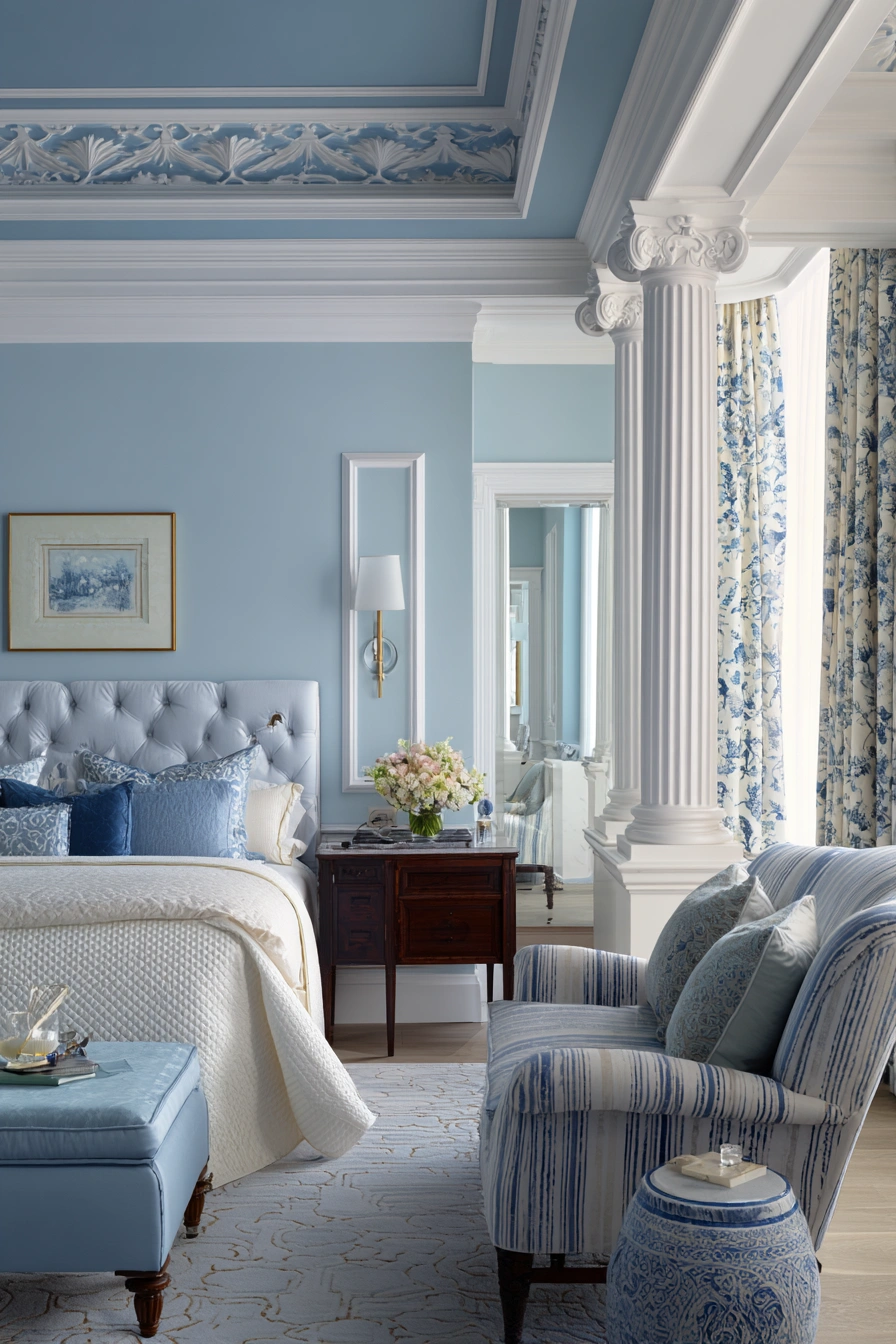
Powder Blue Revival – Classic Blue with a Modern Twist
Be calm. Light and airy. Powder blue and clean white together give wedding rooms a new look that is both classic and fresh. The color narrative is based on calm beach scenes and old-fashioned design styles, but it feels like it was made for today’s modern romantic.
The soft blue velvet upholstered headboard gives the bed a soothing base, and the patterned curtains and striped armchair add variety in tone and texture. White architectural details like arches, columns, and a coffered ceiling add balance and strength to the delicate layers of cloth. The blue ceiling detail is stunning; it makes the area above look like part of the color palette instead of an afterthought.

Blue has traditionally been a color that stands for loyalty and stability, which are two of the most important parts of marriage vows. Here, it seems like it can be used in many ways—it’s classic but unexpected, new but timeless. A great alternative for couples who want peace, calm, and a softly grand setting.
Lilac & Linen – Cool Romantic Minimalism with a Whisper of Spring
Gentle. Light and airy. Lilac tones and creamy linen give wedding rooms a serene but very romantic look. The colors are mostly simple, yet they don’t make the space feel chilly. Instead, they create a space where calm and soft joy meet. The clean lines of the architecture frame the room, while the lavender touches in the pillows, throws, and artwork add harmony without being too much. Knitted poufs and layered fabrics lend depth to the space, making the soft colors feel more grounded.

Natural light coming through black-framed windows makes everything brighter and balances the softness of pastels with the sharpness of structure.
Lilac has always been associated with first love and new beginnings, making it a good option for weddings where meaning and feeling are important. When you add linen’s natural neutrality to the mix, you get a look that is balanced, modern, and soulful. Great for couples who want something that feels effortless, modest, and sweet.
Pistachio & Pearl – Fresh Pastel Meets Sculptural Elegance
Light. Fun. Elegant. When you put pistachio green and creamy pearl together, you get a wedding space that feels both young and elegant. Intricate architectural molding and archways soften the pastel colors, making sure that whimsy never gets in the way of refinement.
The scalloped headboard and silky bedding add a romantic touch, while the mint-green armchair and ottoman make the room feel more comfortable and polished.

The gold embellishments on the side table offer a touch of luxury without ruining the calmness of the pastel layers. The warm light from the windows makes everything look better and gives the room a magical shine. In the past, pastel greens stood for new beginnings and health, while pearl colors stood for purity. They achieve a balance between newness and tradition, which is perfect for couples who want their wedding to feel both delicate and timelessly gorgeous.
Ink & Ivory – Bold Contrast in Urban Luxe Inspiration
Sharp. Up-to-date. Powerful. An ink black and ivory color scheme makes a wedding space that looks polished and confident. This color scheme uses light and dark to create drama without too much decoration. The area is framed by sleek architecture, such as floor-to-ceiling windows, simple ceiling lines, and angular furniture. The black piping on the crisp white bedding gives it precision, while the velvet throw pillows offer richness through texture. A black-and-white abstract painting brings the colors together and adds to the urban elegance.

The skyline behind the scene adds excitement by connecting the elegance of the inside with the vibrancy of the city.
Black has always meant power and depth, whereas white means clarity and new beginnings. They work together to create equilibrium, like yin and yang energy for a wedding. Perfect for couples that like modern luxury: bold, clean, and unforgettable.
Conclusion
The colors used in wedding rooms have come a long way from the usual ones. Now they can be any color that reflects the couple’s personality, meaning, and mood. Today’s most interesting interiors show that color is a story, not just a background. For example, the earthy closeness of Blush & Buff Harmony and the powerful presence of Ink & Ivory. Each color has a meaning: green means fresh beginnings, blue means loyalty, plum means passion, lilac means tenderness, and ivory means new beginnings. When mixed judiciously with texture, light, and architectural detail, these palettes convert rooms into immersive experiences—romantic, anchoring, or aggressively dramatic. The message is clear: modern wedding venues aren’t just about decorations anymore; they’re also about creating emotional landscapes where love seems both timeless and one-of-a-kind.


